


Baseline Fitness
UX/UI & Brand
Overview
Baseline Fitness Building a brand and digital presence from scratch for a new local gym.
Brand & UX/UI Design | 2024 | Limitless Devs
Baseline Fitness had a logo, a rough colour palette, and no website. As a brand new gym in Belmont with no online presence, they needed everything else built from scratch: a complete visual identity, a website that could attract members, and a booking experience that didn't get in the way.
My Role
End-to-end brand development, UX/UI design, and front-end development, from visual identity through to a live, accessible, conversion-focused website.
Disciplines Brand Design, UX/UI Design, Accessible Design, Front-End Development
Deliverables
- Complete visual identity built on the existing logo
- Fully responsive website
- WCAG-compliant colour palette
- Embedded Mindbody booking integration
- Custom front-end CSS styling for the booking widget
1

The Challenge
A new gym with no online presence, no brand, and a colour palette that failed accessibility standards before the first page was built.
Challenge
Baseline Fitness needed a website that could launch the business and convert visitors into members. The lowest barrier to entry was group class bookings, so the entire experience needed to funnel people toward that one action without friction.
Insight
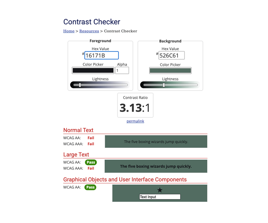
The existing logo was solid but the colour palette had a problem. Black text on army green returned a contrast ratio of 3.13:1, failing WCAG AA for normal text. That meant the brand as handed to me wasn't usable without intervention. Fixing it wasn't optional, it was the first design decision I made.
2
Research
A brand new business means no existing user data, no analytics, no history to learn from.
Who I was designing for
The primary users were local adults looking for a reliable, accessible gym. Secondary users were people interested in trying a group class as a low-commitment first step. Both groups needed the same thing: quickly understand what Baseline offers and book with as little friction as possible.
User Journey
I designed a single, linear journey that progressively answers these key questions:
What is Baseline Fitness?
|
Who is it for?
|
How do I sign up?

The journey ends at a custom-styled embedded Mindbody booking widget. No redirects, no drop-off points, no confusion about where to go next.
3
The Solution
The brand needed to feel like the gym: tough, gritty, high energy. The website had one job: get people to book a class.
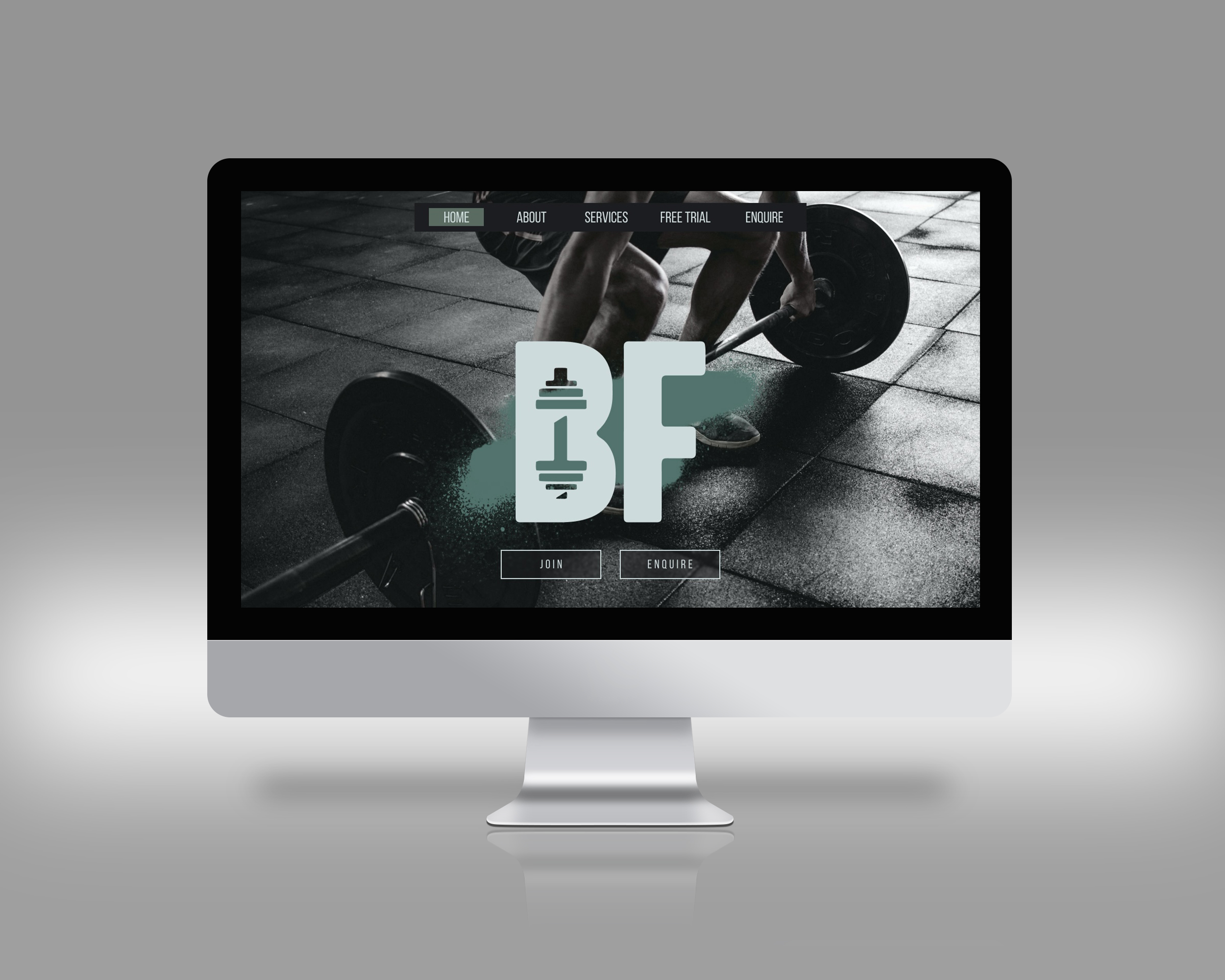
Brand & Visual Identity
Building on the existing logo, I developed a complete visual identity that leans into an army-toned, spray-paint aesthetic. Bold typography, strong visual hierarchy, and a dark palette that reflects the intensity of the space.
The first order of business was fixing the colour palette. The original combination failed WCAG AA at 3.13:1. I developed a compliant palette with light and dark khaki variations, reaching 11.87:1 on the primary text combination, passing both AA and AAA across normal and large text.
With a limited budget for custom illustration, I sourced and adapted equipment symbols from Vecteezy, selecting icons that matched the brand's aesthetic and styling them to feel intentional rather than generic. Small gyms don't always have the budget for custom iconography, but that doesn't mean the result has to look like it.
- WCAG-compliant colour palette with contrast-checked light and dark khaki variations
- Bold typography and strong visual hierarchy supporting user and business goals
- Simplified symbols to quickly communicate available equipment
- Mobile-first layout designed to drive conversions
Booking Integration
The Mindbody booking widget was embedded and custom-styled with CSS to match the brand. For a user ready to book a class, the experience stays entirely on-site. No redirects, no jarring visual breaks, no reason to second-guess the decision to sign up.
Accessibility & Delivery
Every element was checked against WCAG 2.1 guidelines before launch.
- Contrast ratios verified across all colour combinations
- Keyboard navigation and visible focus indicators on all interactive elements
- Semantic HTML and logical heading hierarchy throughout
- ARIA roles implemented for interactive components
- Alt text across all images and media
- Skip navigation to bypass repetitive content
Before launch, the site was tested across Chrome, Brave, Firefox, Edge, and Safari on mobile, tablet, and desktop.
As part of this project, I developed and implemented an updated go-live checklist for Limitless Devs that incorporated a dedicated accessibility checking layer. It's now part of the standard delivery process across projects.
4
Impact
Users followed the intended journey from top to bottom.
User behaviour validated the design decisions. Users followed the intended journey, engaged with key content sections, and the majority reached the booking section. The sticky navigation and booking CTA became the most frequently used elements for returning visitors.
Performance
Desktop PageSpeed Insights returned 90% performance, 90% accessibility, and 100% for both best practice and SEO. Mobile performance came in at 63%, largely driven by load overhead from the embedded Mindbody booking widget, a third-party constraint outside of my control. Accessibility and SEO held strong on mobile at 86% and 100%.
Recognition
The brand and website I designed for Baseline Fitness were featured in a Belmont Small Business Award–winning submission by Limitless Devs.
Client Impact
The new website became the primary touchpoint for new member enquiries.


